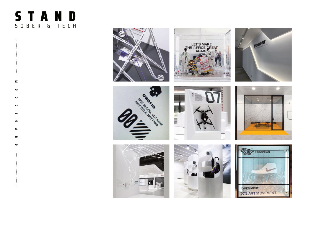
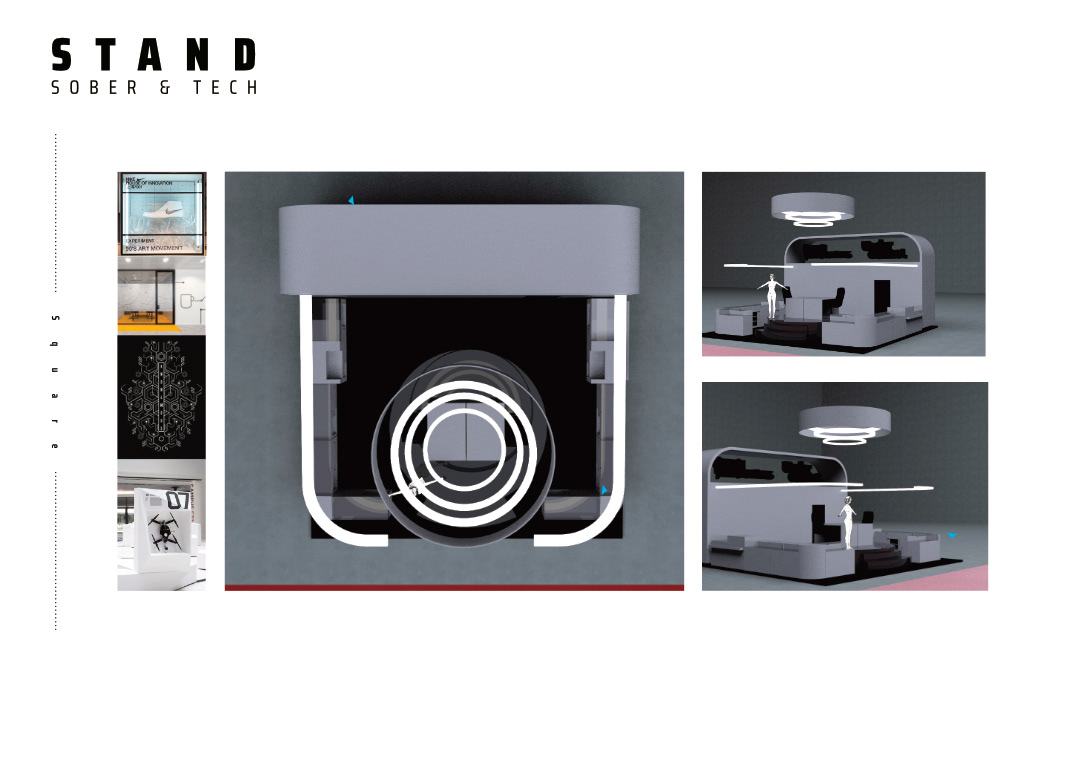
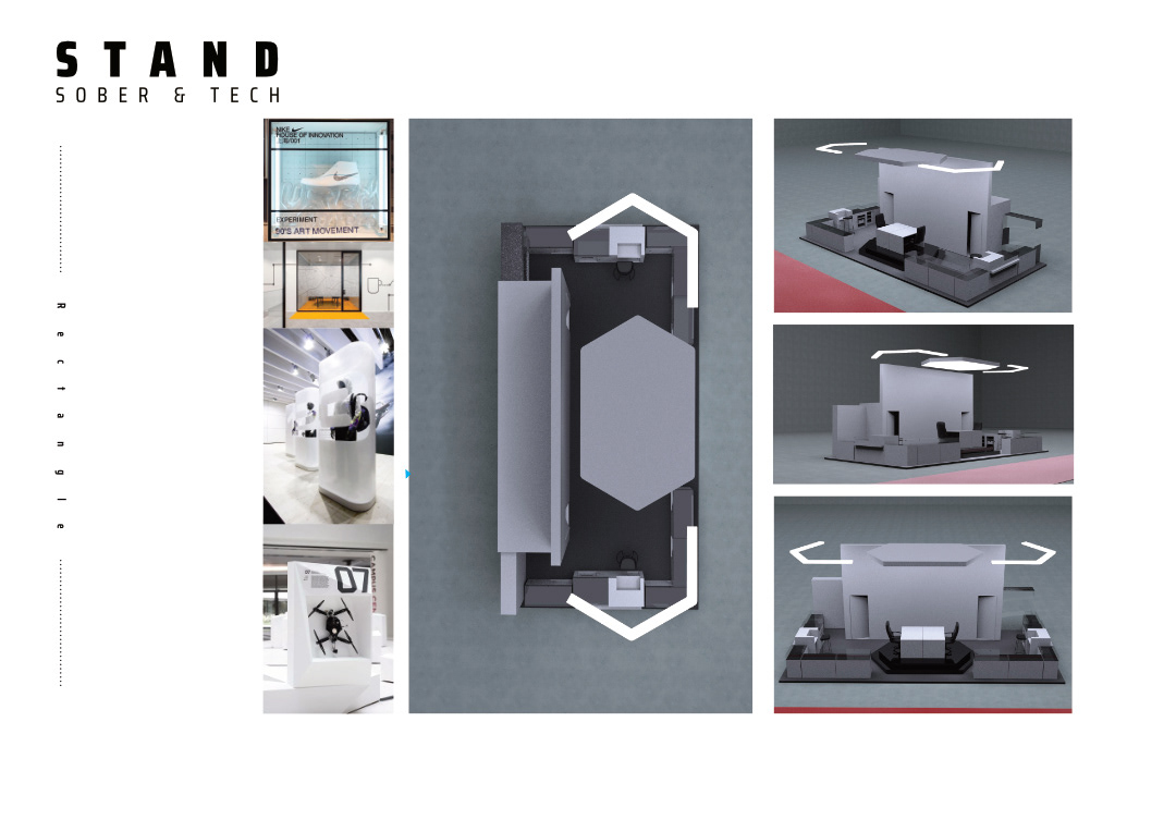

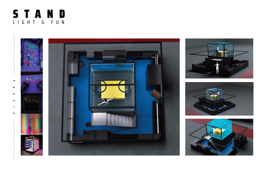
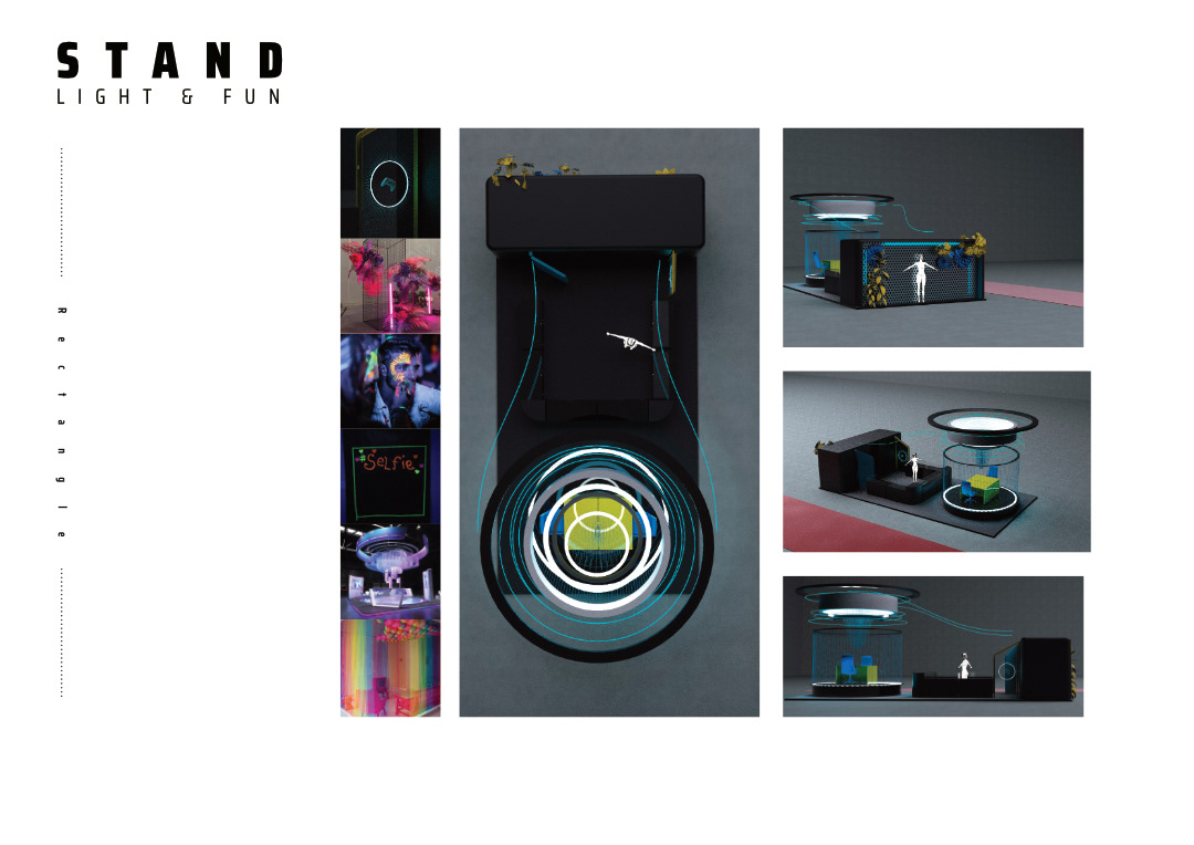
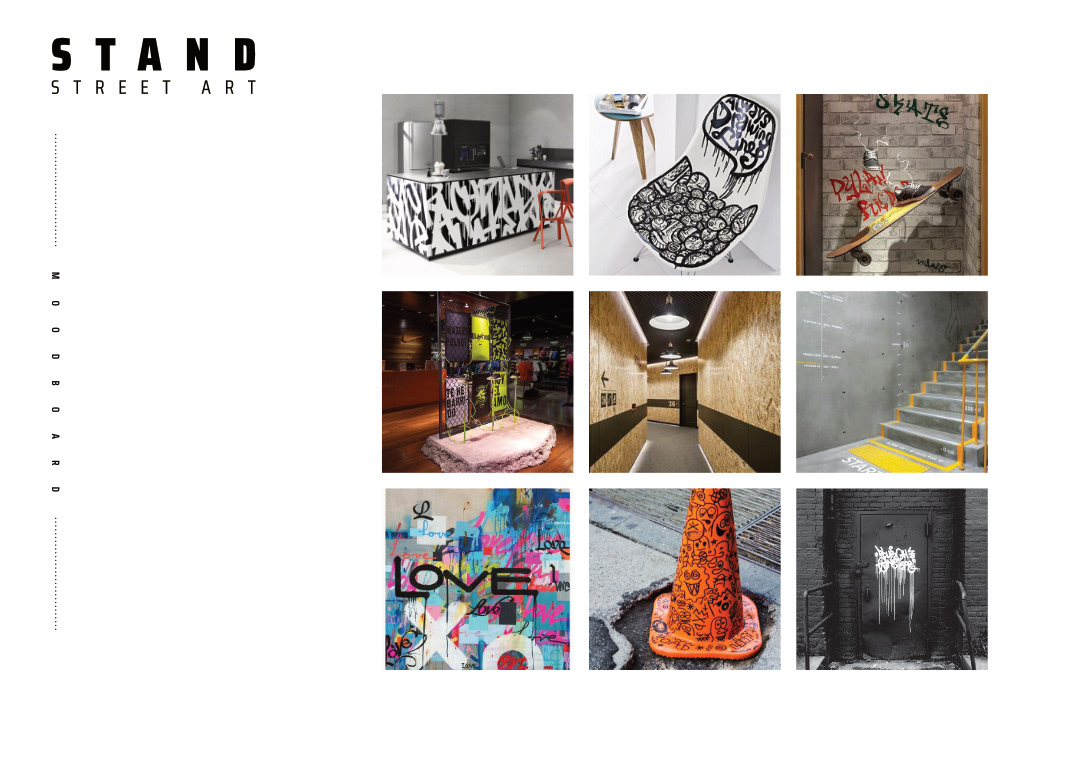
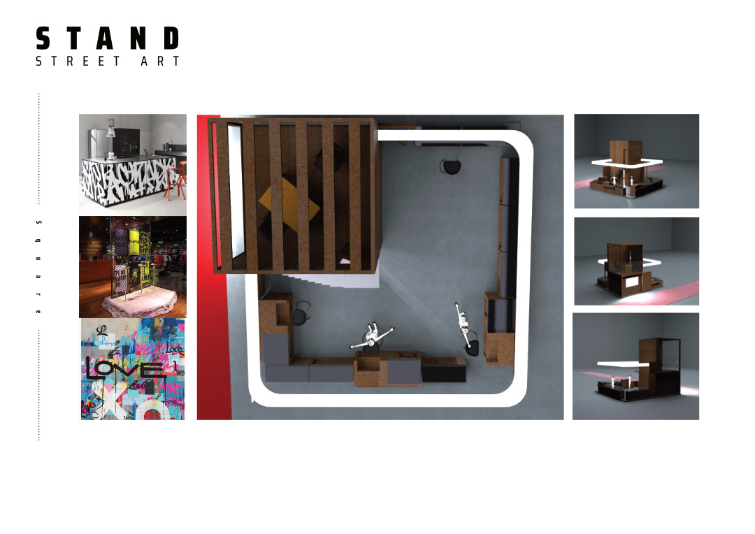
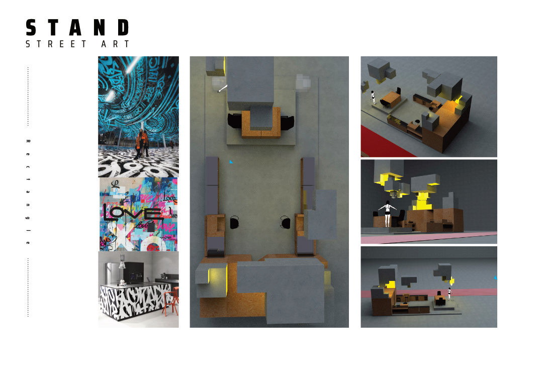
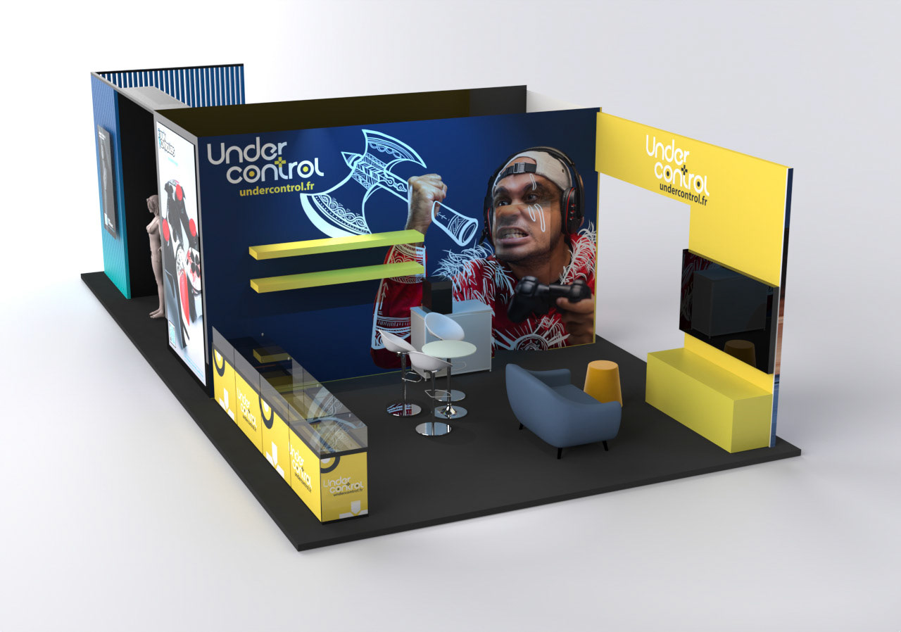
After having presented the 3 axes of directions as visible above, the BC team chose the "light & fun" design. As a result, two concepts followed in both a square and a rectangular version. The first one hosts both brands under the same roof, while the second concept sees Under Control and Burn Controllers each in their own dedicated space while maintaining a common link.

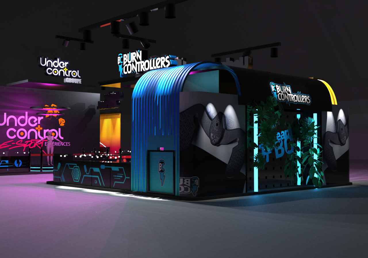
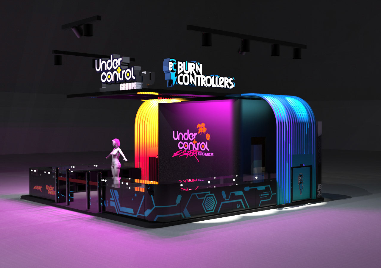
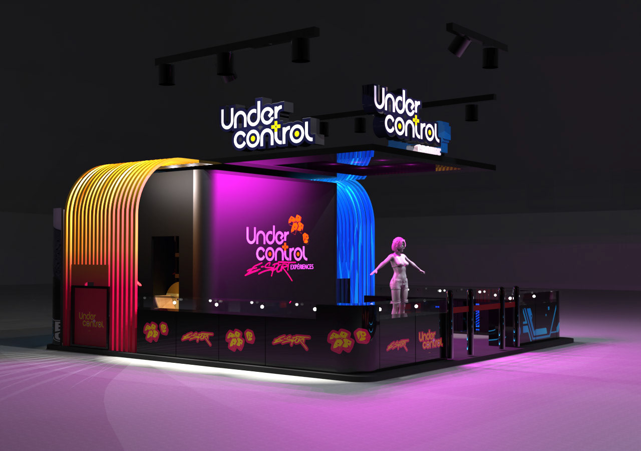
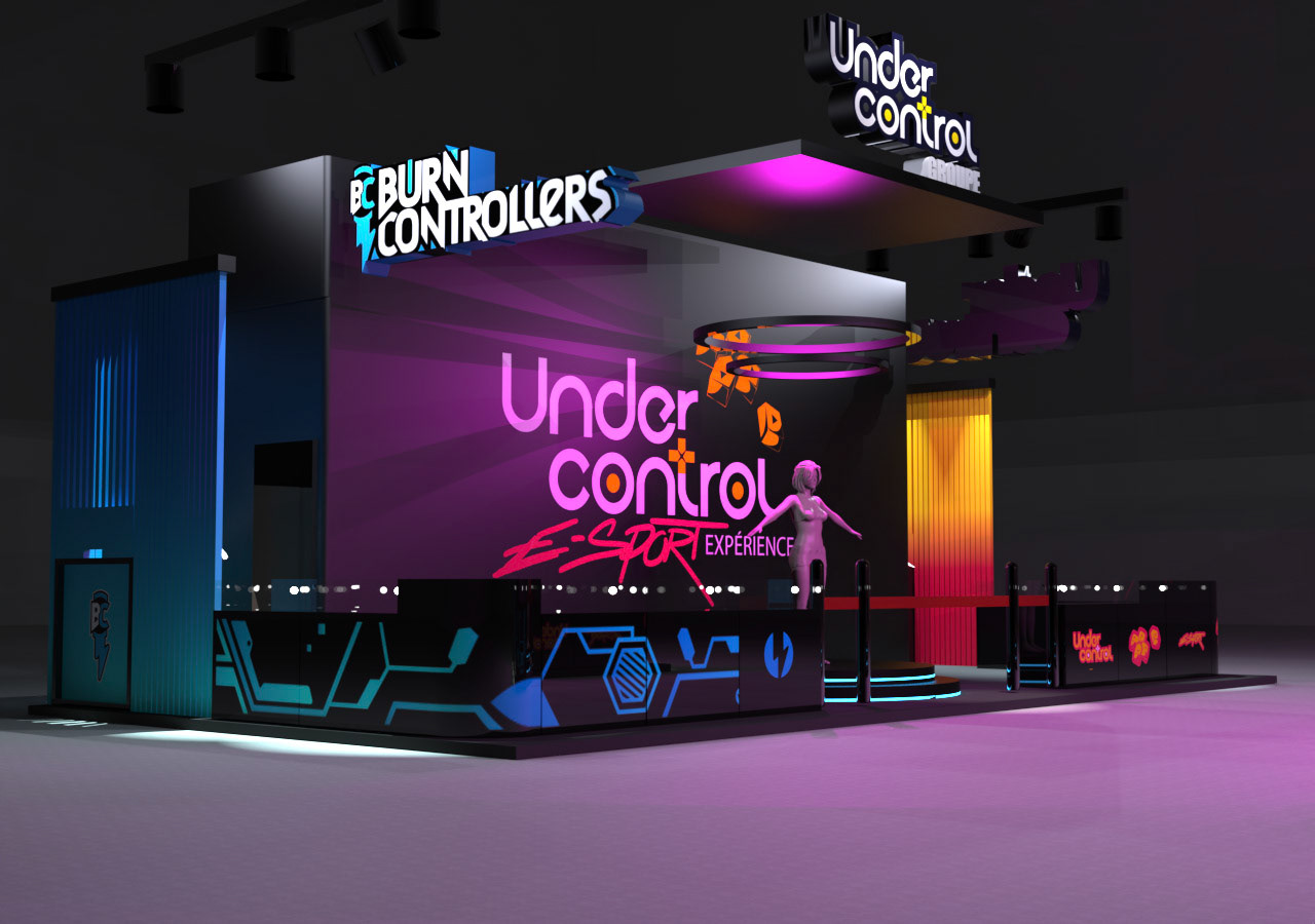

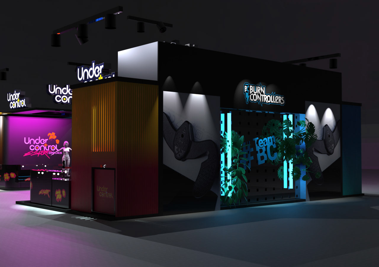
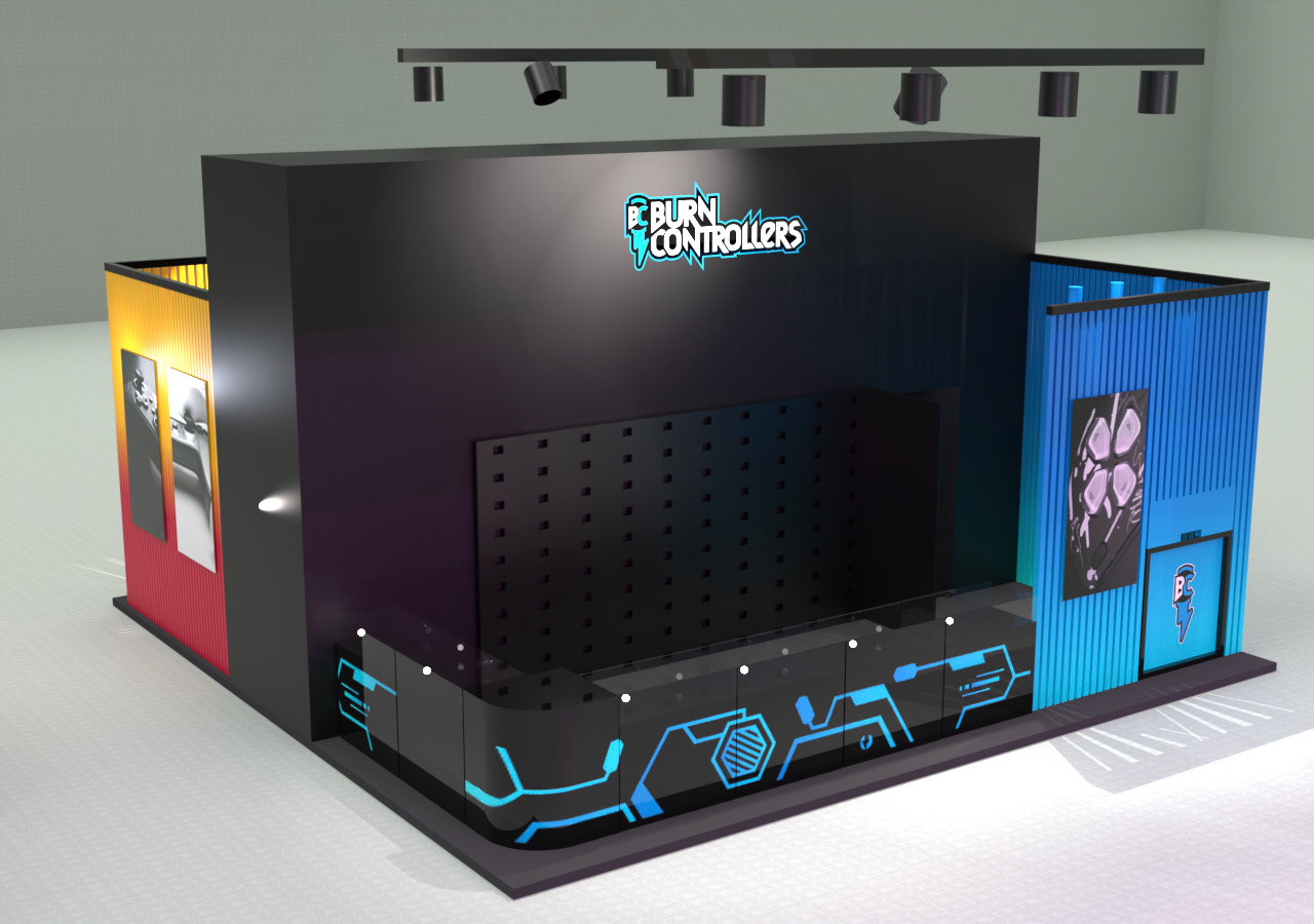
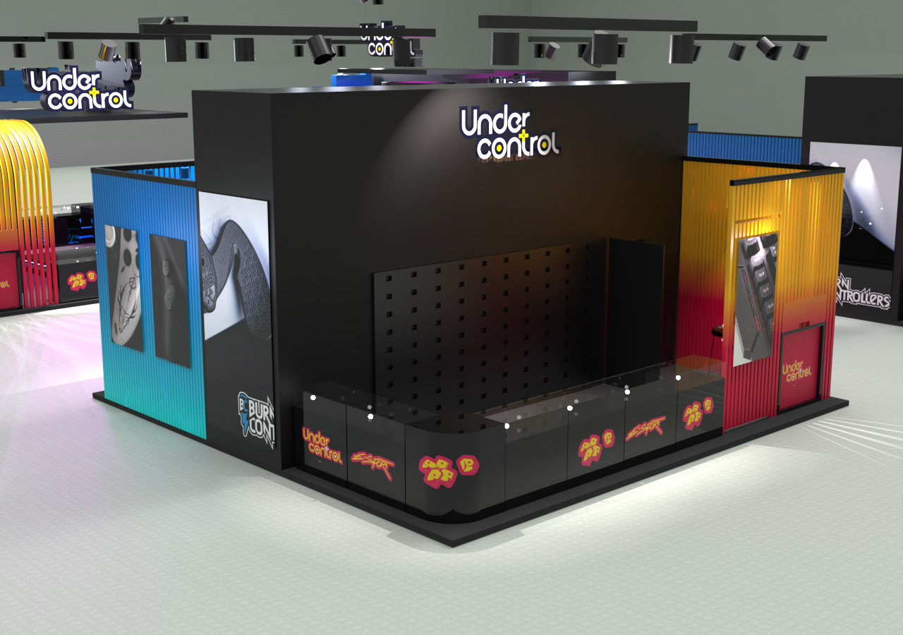

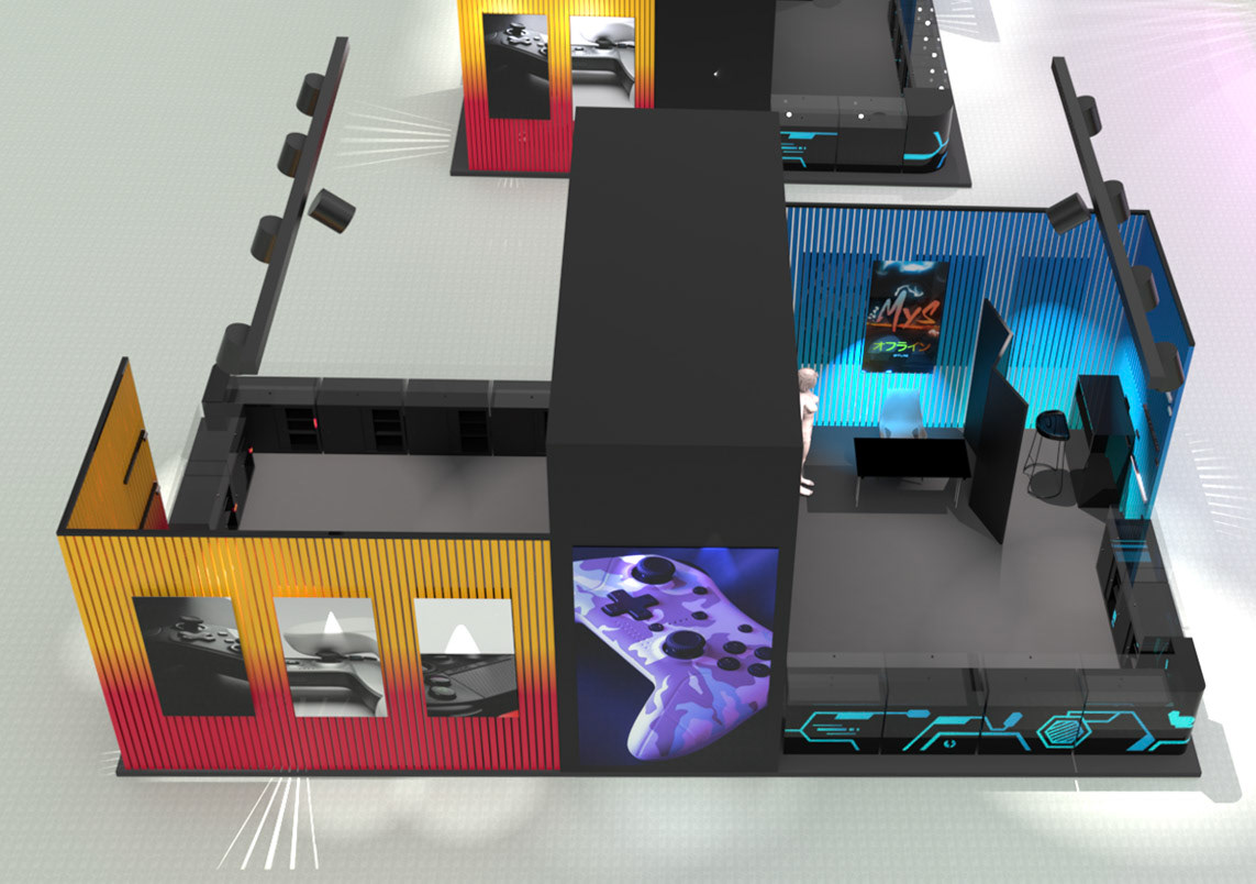
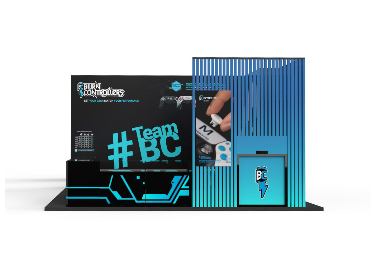
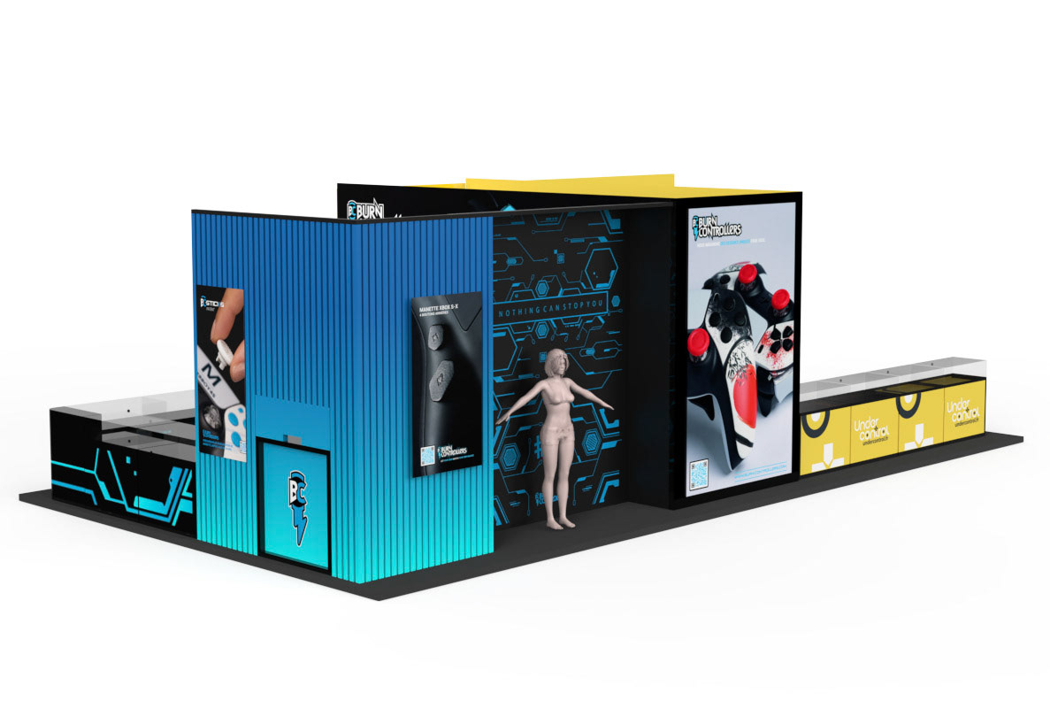
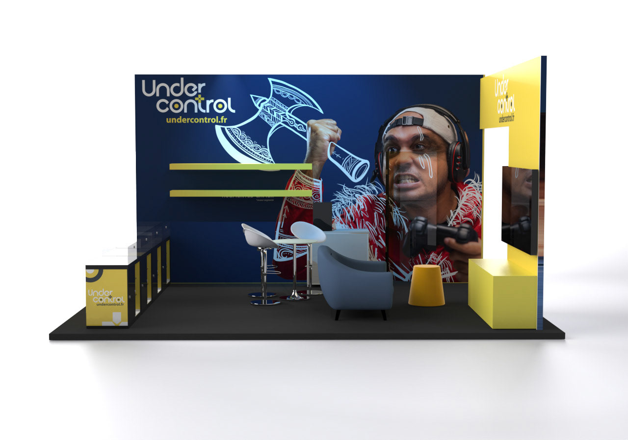
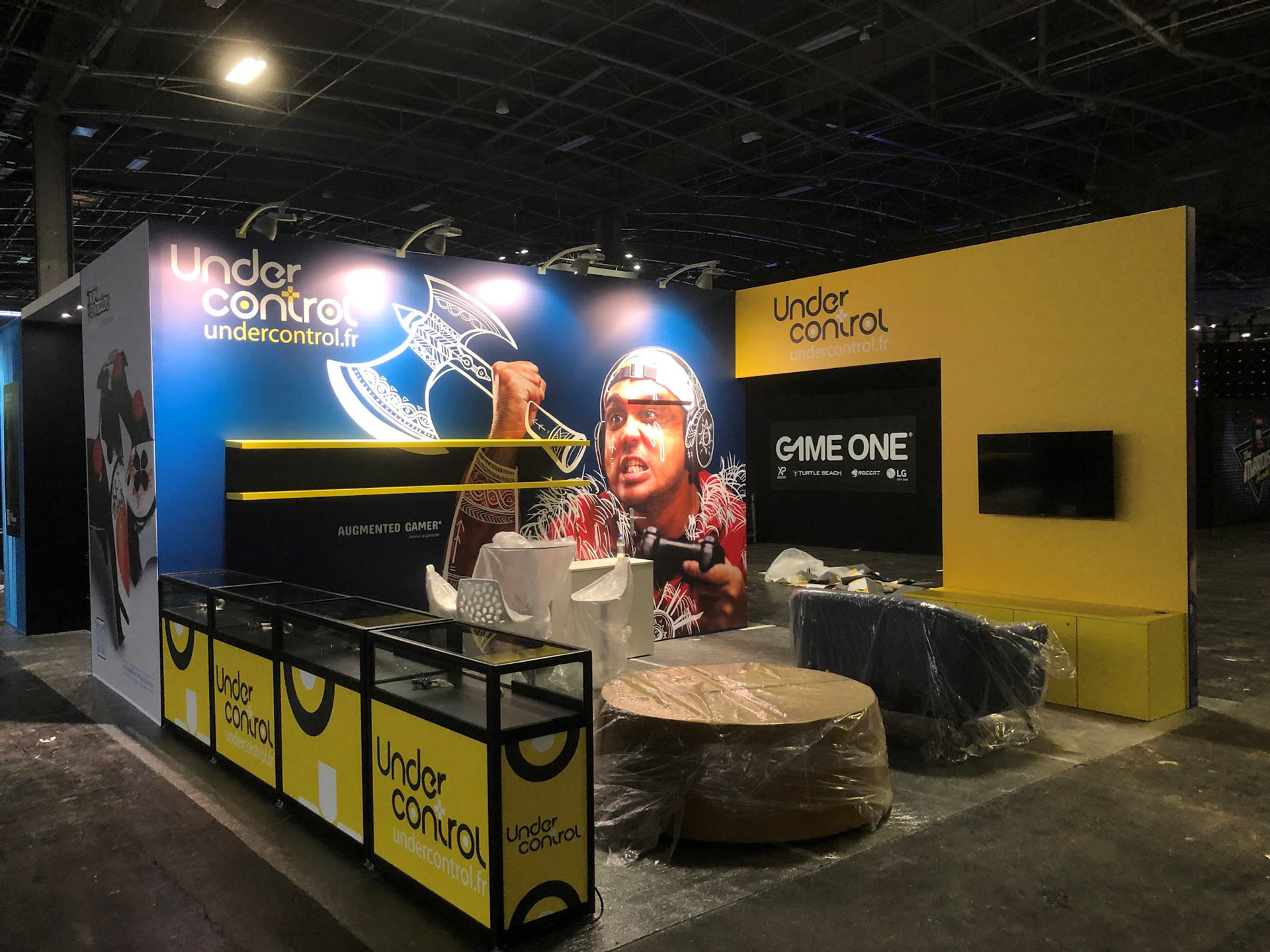
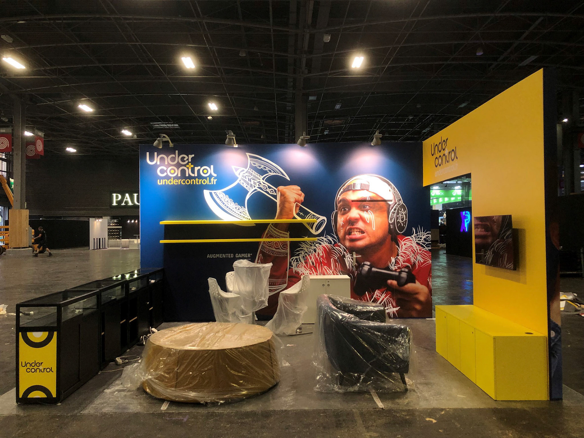
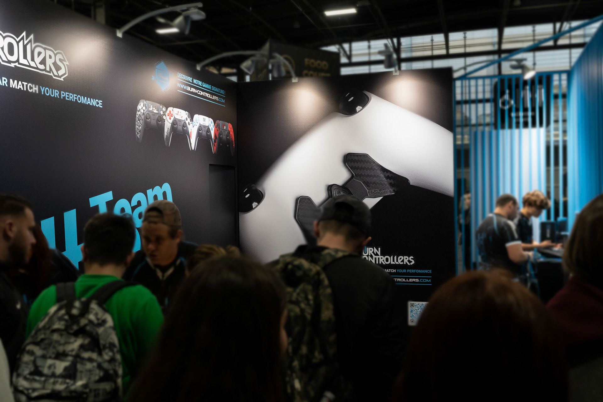
The proposal was presented to the UC and BC team and the concept with separate spaces has been chosen. The design has then been refined in collaboration with L'agence 44. While the Under Control space followed the idea of a chill-out area, the Burn Controllers area was busy and sales-driven.



For this project the used tools were :
- Rhinoceros for the 3D modeling and blueprinting
- Keyshot for the final pictures
- Photoshop and Illustrator for the adverts on the stand
- Powerpoint to present the project to the team and booth builder
